Overview
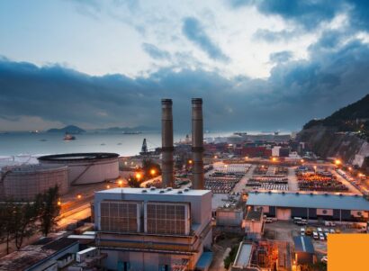
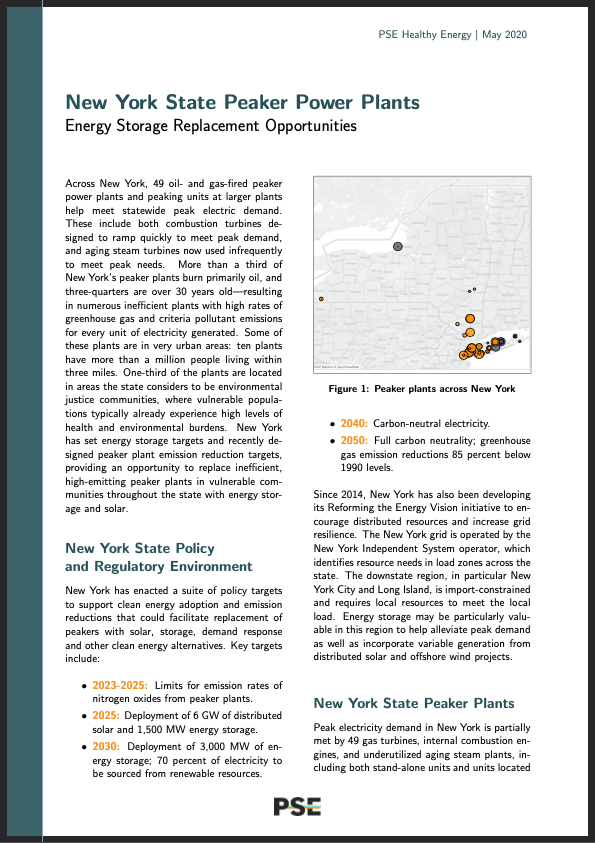
In this analysis, we assess where solar and storage have the potential to replace existing New York State peaker power plants and where their deployment may yield the greatest environmental health and equity benefits. Across New York, peak electric demand is met in part by 62 oil- and gas-fired peaker power plants and peaking units at larger plants. These facilities include both combustion turbines designed to ramp quickly to meet peak demand, and aging steam turbines now used infrequently to meet peak needs. More than one-third of New York’s peaker plants primarily burn oil and over three-quarters are at least 30 years old—resulting in numerous inefficient plants with high rates of greenhouse gas and health-damaging pollutant emissions for every unit of electricity generated. Some of these plants are in dense urban areas: more than a million people live within three miles of twelve of these units. Nearly a third of the plants are located in areas the state considers to be environmental justice communities, where vulnerable populations typically experience high levels of health and environmental burdens.
New York State has set a target to adopt 1,500 megawatts (MW) of energy storage by 2025 (e.g. to install large batteries for the electric grid) and 3,000 MW by 2030. The State also recently set forth regulations to phase out peakers with high nitrogen oxide emissions between 2023 and 2025. These measures provide an opportunity to replace inefficient, high-emitting peaker plants with energy storage and solar in vulnerable communities throughout the state. New York’s peak electric demand is met with a mix of small combustion turbine units and large, under-utilized steam power plants, both of which may be good targets for replacement with energy storage. Storage is currently most cost-competitive with peaker plants, but moving forward this approach can set a precedent for displacing fossil fuel power plants across the grid.
New York State Peaker Power Plant Mapping Tool: Explore and visualize peaker plant data including data on operations, greenhouse gas and criteria pollutant emissions, and nearby population demographics for oil- and gas-burning power plants used statewide to meet peak electric demand. We include combustion turbine, steam, low-use natural gas combined cycle, and internal combustion power plants and units at larger plants that are 5MW or larger and burn oil and gas at a low capacity factor—less than 15 percent. The data do NOT include nuclear, solar, wind, hydro, biomass, coal, or geothermal generation. New York State Summary (2020): Read about our findings for energy storage peaker plant replacement opportunities. Technical Documentation (2020): Look up data sources, methods, and a discussion of state-level policy and regulatory considerations.
New York Peaker Power Plant Mapping Tool
Data are available in multiple views. Click below to explore:
- Statewide Map and Demographics: Map New York power plants and visualize demographic data for nearby populations.
- Cumulative Environmental Justice Index: Compare plants across an Index of environmental, health and socioeconomic burden indicators for populations living nearby.
- Individual Plant Demographic View: Search for data on populations living near an individual power plant.
- Individual Plant Operational View: Search for individual power plants and visualize historic generation and emissions data.
- Plant Indicator Ranking: Rank plants by selected environmental or demographic indicators.
- Data Comparison View: Select, compare and plot user-specified data sets.
Quick Tips
- For a full-screen visualization: Click on the full-screen icon
 at the bottom right corner of a tab.
 - To download images or data from an individual plot or map: Click on the download icon
 at the bottom right of that figure.
 - To undo all filters: Click on the revert icon
 at the bottom right corner of a tab.
 - To embed or share a link to a specific map view: Click the share icon
 on the bottom right of your map results.
 - To re-center maps: Click on the home icon
 , which appears when you hover in the top left corner of the map.
 - To look up terminology: Use the Glossary page.
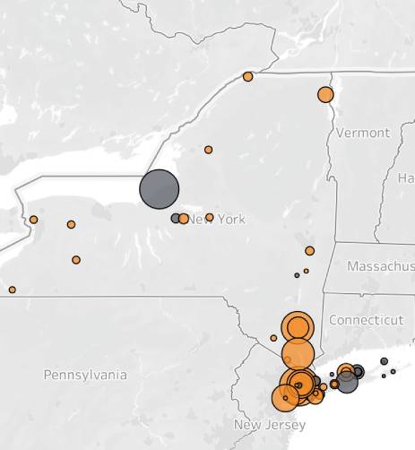
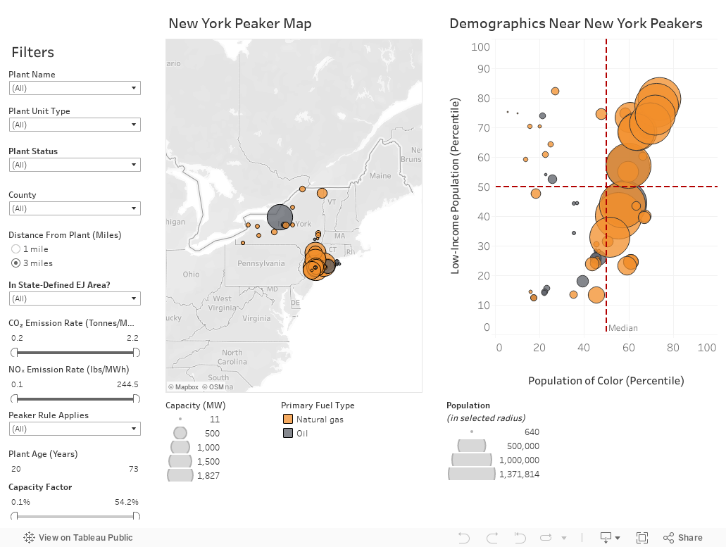
New York Peakers: Statewide Map and Demographics
Explore a map of New York’s peaker power plants and the populations around them. Hover or click on an individual plant on the map to pull up its data. Use filters to select measures such as Plant Name, Plant Unit Type, or whether the census tract it is located in is considered defined by the state to be an Environmental Justice Area.
Example question: Which plants are located in urban communities of color? Larger circles on the right hand figure indicate more people live nearby.
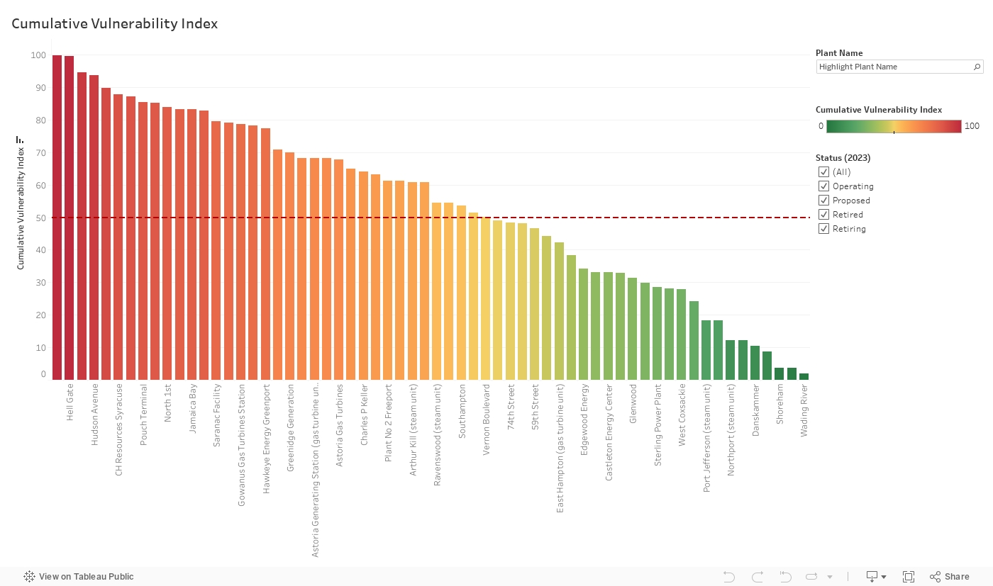
Cumulative Environmental Justice Index
We developed a Cumulative Environmental Justice Index (EJI) to compare the socioeconomic and environmental burdens on communities living near each power plant. This index is calculated for the population living within a given distance from the plant by averaging the state percentile rankings for fifteen environment indicators and eleven socioeconomic indicators aggregated from the CDC’s Environmental Justice Index (see Glossary for methods). The selected area’s EJI is then compared to every census tract in the state, such that an EJI of 90 has a higher cumulative environmental justice burden than 90 percent of census tracts in the state. Below, select a Distance from Plant of 1 or 3 miles to view the populations living within this distance of each plant, or filter to see if the plant is operating, retiring, or retired. Note that distinct peaking unit types at the same power plant (e.g. a gas turbine and a steam turbine) are shown separately.
Example question: Which plants are located in communities with high cumulative environmental, health and socioeconomic burdens?
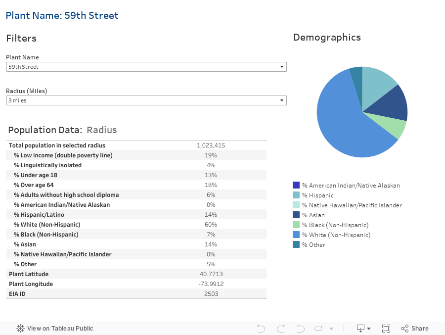
Individual Plant Demographic View
Look up an individual Plant Name to find the demographics of populations living near the plant. Select a Radius of 1 or 3 miles to find average data for populations living within the chosen distance from the plant.
Example question: What is the total population living within one mile of a plant?
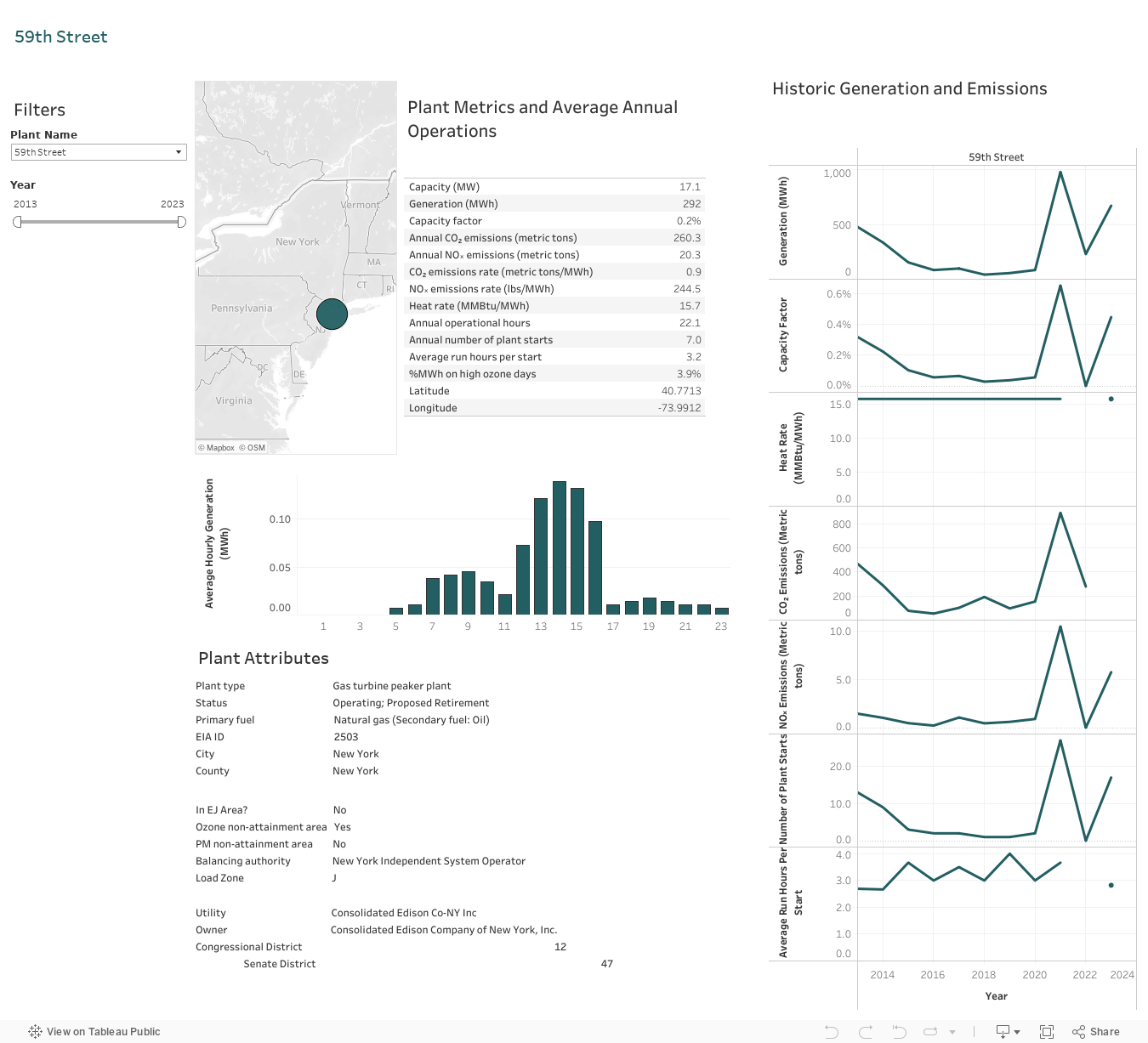
Individual Plant Operational View
Look up an individual Plant Name to find information such as where the plant is located and the plant’s historical generation and emissions. Use the Year filter to find the average annual generation and emissions over the selected time period. Click on additional tabs to view a table or figure on its own.
Note: Reported emissions for plants with very low capacity factors show more discrepancies and these data may be less reliable.
Example questions: How many times does a plant start per year? Plant start-up periods have higher emission rates. How many hours does it run when it is turned on? 3-5 hours might be a good match for energy storage.
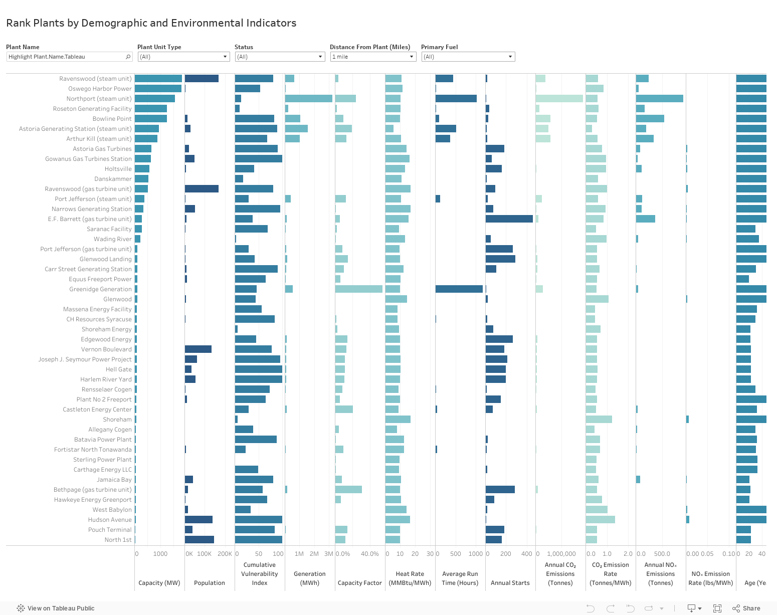
Plant Indicator Ranking
Hover below a column and click the sort icon ![]() to re-rank the plants by a given environmental, demographic or operational indicator value. By default, the columns are ranked by capacity (size). Use filters to select the Plant Unit Type and the Distance from Plant used to analyze population data.
to re-rank the plants by a given environmental, demographic or operational indicator value. By default, the columns are ranked by capacity (size). Use filters to select the Plant Unit Type and the Distance from Plant used to analyze population data.
Note: Some data, such as generation on poor air quality days, are missing for certain plants. In addition, reported emissions for plants with very low capacity factors show more discrepancies and these data may be less reliable.
Example question: Which plants have the highest emission rates of nitrogen oxides (NOx) for every megawatt-hour (MWh) of electricity generated? A MWh of an alternative resource would have the greatest emission benefits from displacing a MWh from one of these plants.
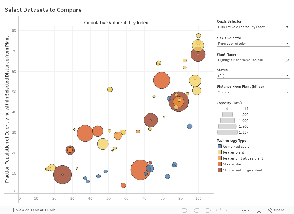
Data Comparison View
Choose which datasets to compare to create your own plot. Select X-Axis Selector and Y-Axis Selector to choose two datasets to compare. Use the Distance from Plant filter to select population in a 1- or 3-mile distance from the plant.
Note: Some data, such as run times, are missing for certain plants. In this case, individual plants without data will not show up under search bar.
Example question: Which plants are old and have low capacity factors? These might be good candidates for replacement.
More Information
See Glossary for definitions and Technical Documentation for methods and data sources.
Contact Us
To ask questions, make comments, report any errors in the data, or request a walk-through of the data visualizations, please contact us at: info@psehealthyenergy.org. These data are accurate to the best of our knowledge, but there are sometimes discrepancies in data aggregated from multiple sources and there may be errors in the compilation. We would appreciate your input if you notice any anomalies or inaccuracies to help us improve these visualizations. We are also eager to help you navigate and use the tool, so please reach out if we can help you use the tool to answer any specific questions!
Data last updated October 2024.