Overview
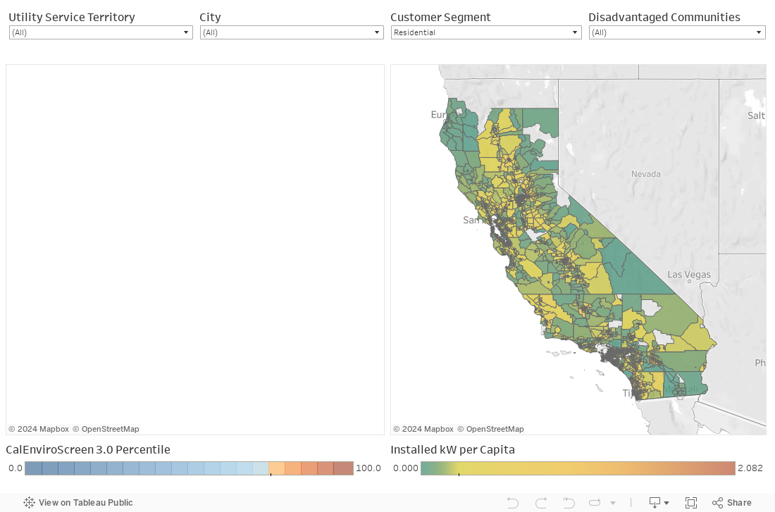
The California Solar Map is an interactive mapping tool that visualizes data on distributed solar adoption in California. The data include distributed solar (PV) deployment rates by census tract, environmental justice (EJ) metrics, utility service territory, and year (1998-2017). The interactive map provides customized views — filterable by utility service territory, city, customer segment or disadvantaged communities (DACs) — that can be shared as links or embedded on your site. Data are available in multiple views. Click below to explore:
- Map View: Map of solar adoption rates and environmental justice communities based on CalEnviroScreen 3.0.
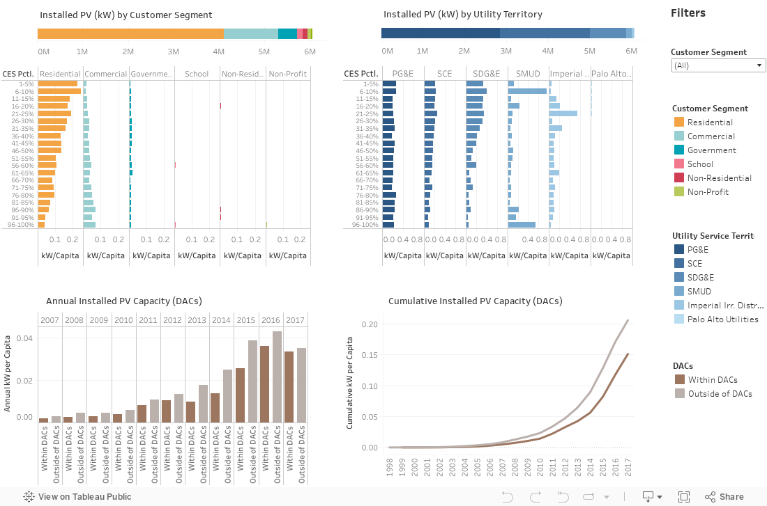
- Statewide Data View: Statewide data by customer segment, utility service territory and disadvantaged communities.
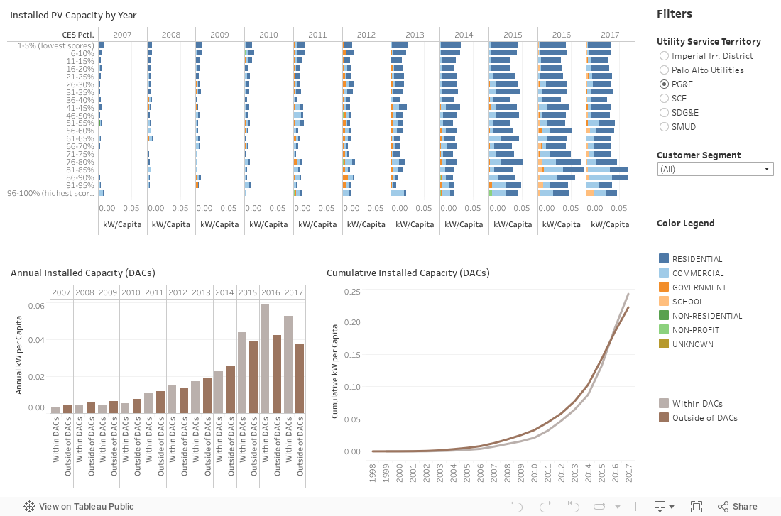
- Utility Territory Data View: Utility-specific data viewed by year, customer segment, and environmental justice metrics.
Quick Tips
- Adjust the filter criteria and search by city or utility territory to customize your results.
- To undo all filters, click on the “reset” button at the bottom right.
- For best visualization, click on the “full screen” button at the bottom right corner.
- Download any data by selecting the chart/map you are interested in and pressing the “download” button at the bottom right.
- For details on the data and methodology, please refer to the Notes below.
Map View
Statewide Data View
Utility Territory Data View
Notes
1 Distributed solar (PV) deployment data were obtained from the most recent edition of Lawrence Berkeley National Lab’s (LBNL) Tracking the Sun 2018 database. 2 CalEnviroScreen (CES) is California’s environmental justice (EJ) cumulative impact methodology, which develops an EJ score for each census tract in California based on its statewide percentile values for 20 different socioeconomic, environmental, health, and demographic indicators. 3 Disadvantaged communities in California (DACs) are communities that score in the top 25% of census tracts statewide in CalEnviroScreen 3.0. Census tracts that do not have an overall CalEnviroScreen score but are in the highest 5% of CalEnviroScreen’s Pollution Burden indicator are also designated as disadvantaged communities. 4 Data presented here cover the following utility territories in California: Pacific Gas & Electric (PG&E), Southern California Edison (SCE), San Diego Gas & Electric (SDG&E), Sacramento Municipal Utility District (SMUD), Imperial Irrigation District and City of Palo Alto Utilities.
Contact Us
For questions, comments, or to report any errors in the data, please email Dr. Boris Lukanov at blukanov@psehealthyenergy.org. The data are accurate to the best of our knowledge, but there may be discrepancies due to data aggregated from multiple sources or errors introduced during the compilation. We appreciate your feedback.