Overview
The Public Safety Power Shutoff Map displays the frequency and duration of Public Safety Power Shutoff (PSPS) outages in California by aggregating and visualizing data from the State’s six investor-owned utilities. This data is paired with selected economic, demographic, and climate vulnerability information for each census tract.
The Public Safety Power Shutoff Map is a free tool developed for community groups, non-profits, community choice aggregators, citizens, and decision-makers, that allows users to customize views of PSPS data. Viewers can focus on regions or populations of interest by filtering the data by county, utility, CalEnviroScreen score percentile, and more. It is important to note that PSPS events are only one type of outage impacting communities and one of the only types of outage in California required to make data available that allows for census-tract level mapping.
Data are available in multiple views. Explore the following visualizations:
- PSPS Frequency by Census Tract: Explore how often, on average, a census tract experiences a PSPS outage and compare demographic and environmental justice information between communities.
- PSPS Duration by Census Tract: Explore how long, on average, PSPS outages last in different census tracts and compare demographic and environmental justice information between communities.
- [Forthcoming] PSPS Lookup Table: Look up specific areas to compare PSPS impacts as well as demographic and environmental justice data between them.
Quick Tips
- To see information about census tracts: Hover over the appropriate census tract.
- To zoom into a specific place: Click on the magnifying glass in the upper left hand corner of the map and type in a zip code or the name of a city, town, etc.
- For a full-screen visualization: Click on the full-screen icon at the bottom right corner of the visualization.
- To download images or data from an individual plot or map: Click on the download icon at the bottom right of that figure.
- To embed or share a link to a specific map view: Click the connections icon on the bottom right of your map results.
- To undo filters: Click on the red ‘x’ at the top right corner of the filter or click on the revert icon in the bottom right corner of the dashboard.
- To look up terminology: Use the glossary included in the Definitions & Descriptions of Data document, which includes definitions, clarifying information, and data sources.
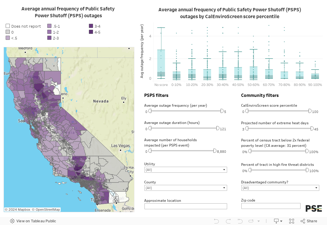
PSPS Frequency by Census Tract
This map display the average annual frequency of PSPS outages for each census tract. Hover text includes further information about PSPS outages as well as select income, demographic, and projected extreme heat data. Alongside the map is a box plot that shows the range of outage frequencies for census tracts in different CalEnviroScreen deciles.
The map and graph can be filtered using outage-focused filters, community-focused filters, or both. Combine different filters to answer questions about who is impacted by the most frequent outages or how often certain communities experience these outages.
Sample question: Which disadvantaged communities experience PSPS outages most often?
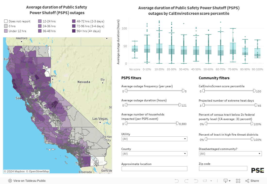
PSPS Duration by Census Tract
While otherwise the same as the dashboard above, this map and plot display the average duration of PSPS outages for each census tract.
Sample question: Which low-income communities experience the longest duration outages?
Forthcoming: PSPS Lookup Table
To complement the above maps, which illustrate geographic trends in PSPS frequency and duration, the lookup table will display a tabular list of PSPS event information by census tract. This includes the average frequency of outages per year, the total number of outages experienced, and a breakdown of each PSPS event that may have impacted a census tract. This data is presented alongside selected demographic, economic, and heat/fire threat data.
Use the filters to explore data for specific census tracts or to aggregate data for zip codes, counties, and utilities.
Sample question: How many PSPS outages did my zip code experience in 2020 and how long did they last on average?
[Table Forthcoming]
More Information
The underlying data on these events—such as outage durations and numbers of impacted customers—are from PG&E, SCE, SDG&E, and PacifiCorp as well as the California Public Utilities Commission. Data reflecting the economic, demographic, and climate vulnerability of communities are from the U.S. Census Bureau and various California state agencies. See Definitions & Descriptions of Data for an explanation of dashboard terminology, data definitions, and a record of data sources and Methodology for further information about how the data was compiled and apportioned.
These data are accurate to the best of our knowledge. However, maps are not exact, as discrepancies can arise from using publicly available data and statistical methods to map impacted circuits to census tracts in the absence of private data available only to the utilities. In some cases, households experiencing PSPS impacts may be assigned to the incorrect census tract, or missing altogether, due to missing circuit locations and a lack of information on circuit sectionalization / the precise location of households impacted by PSPS events. Additionally, these maps only include data from California’s investor-owned utilities, as publicly owned utilities and rural electric co-ops have different reporting requirements for outages.
For further information about mapping outages and power reliability reporting, see Mapping Public Safety Power Shutoffs: The Importance of Accessible Data for Community Resilience Planning. For a statistical analysis of PSPS events, read Preventing Wildfires with Power Outages.
Contact Us
This dashboard is a work in progress and data will continue to be updated and refined. Please contact Bethany Kwoka at bkwoka@psehealthyenergy.org with any questions, to report errors, or to request a walkthrough of the visualizations. We would also appreciate your input if you notice any anomalies or inaccuracies to help us improve these visualizations. We are eager to help you navigate and use the tool, so please reach out if we can help you use the tool to answer any specific questions.

 Definitions & Descriptions of Data